

GRANATUR
GRANATUR is a company that works in the field of Marble, Granite and Limestone transformation and application.
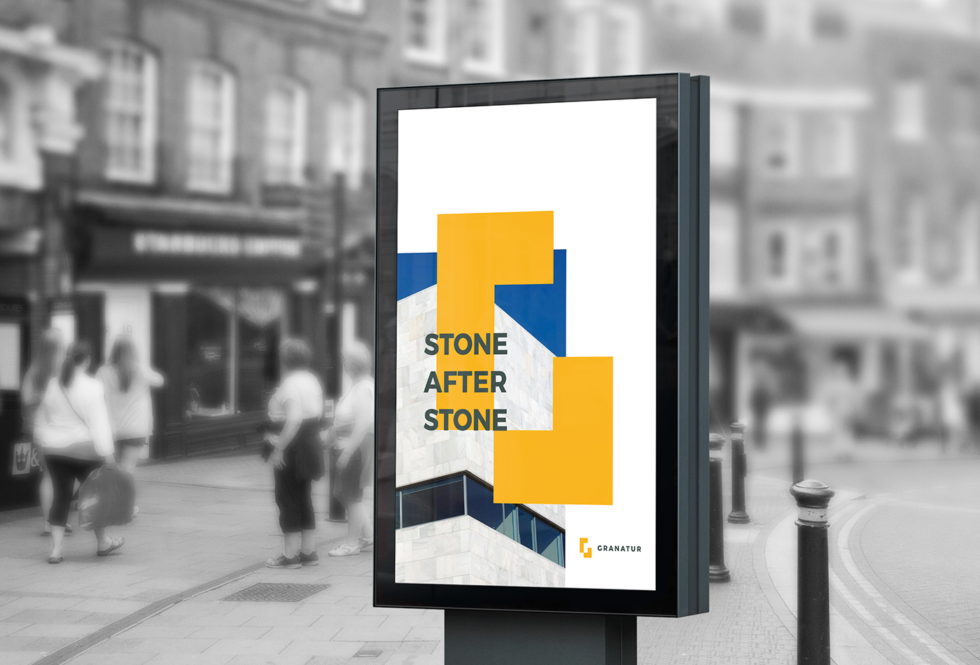
For their new corporate identity, the main purpose was to create something remarkable, simple and easy to memorize in order to quickly identify the company while being conceptually linked to their business area.

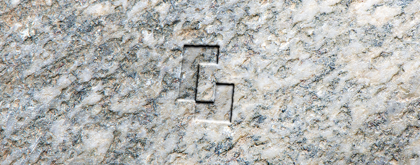
The "G" icon was created from simple shapes and straight lines. It symbolizes the cut of the stone for the various applications of the company. Its simplicity allows for the quick identification of the brand, giving the company the intemporal look that it deserves.


GRANATUR HOME DESIGN
GRANATUR HOME DESIGN is a self contained brand from Granatur. It works in the production of home decoration made from the raw materials that Granatur produces.
While Granatur as a company has to transmit a sober and solid image to demonstrate the rigor and presence of the brand, at Granatur Home Design the aim is to innovate and demonstrate an expanding and changeable universe that fits the various products of the brand, while mantaining the original connection with Granatur. In this way the symbol was considered as the starting point for the most varied visual compositions, resulting in a new logo that houses in itself dozens of other logos and different representations. An identity with identities inside.


LIKE / SHARE
THANK YOU


